
If you want to learn how to take better photos for your business, website or online shop then check out the following tips!
Did you know that visual content is more than 40 x more likely to get shared than any other type of content? (source). The images that are most likely to get shared are those which are high quality and look great. When it comes to your business, whether you are a blogger, shop owner or any other type of entrepreneur, photography is not something you can ignore, or risk doing to a mediocre standard.
That's why I have written this list of 11 simple photography tips that you can use when taking photos for your website. These are all tips that you can apply when taking your images to ensure they are better quality and more 'shareable'.
Styling
1. Choose Your Props Wisely
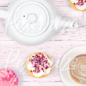
Image made using Pixomize
Choosing your props to use in your photograph is really important because they are what the photo is of. Your props have to fit the theme of your image, suit your target audience and they have to look the part.
For example the image above is a tea party themed photograph, so I used a teapot, tea cup and cupcakes, as they all fit within that theme. I also wanted the image to appeal more to females who like 'pretty' and 'girly' things, so I chose a pink background and pretty cupcakes. Finally I ensured that all of the props for the flat lay photo were high quality and clean. Imagine how bad the image would look with a brown, dirty teapot and smudged icing on the cupcakes - not very appealing!
So when choosing your props remember: theme, audience and quality.
2. Color Palette

Image made using Pixomize
As I mentioned in the previous point - all of your props must suit the theme of your photograph. This not only means that they should work together because of their purpose, but also in how they look. If the colors in a photograph work well together then the overall image will automatically look more appealing.
I usually choose about 2 main colors and a couple of accent colors for my photos. In this example of the flat lay photograph above, the colors are green and white with a touch of black and gold. I love using this color palette as it is neutral and works well on so many blogs and websites.
Try not to use too many bright colors together. I prefer to use more subtle colors in photography anyway, but if one of your props is really striking, surround it with less obvious props and styling. This will make the image stand out and not look too overwhelming.
3. Crop Out Some Edges
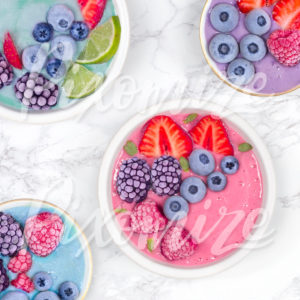
Image made using Pixomize
Don't be afraid to crop out parts of your props in your photograph. This seems obvious, but I know so many people who try to include everything in the frame and think they will ruin the photo if they don't. The truth is most photographs look better when parts of the image have been cropped out!
Take the example image above. If I had included all of the edges of all the bowls, not only would it not look so striking, people wouldn't know where to look. When I cropped out the edges of the smoothie bowls, the pink one instantly stood out and made the image more eye catching.
4. Sometimes Less Is More

Image made using Pixomize
It's easy to get carried away when styling your photographs. If you have just bought loads of beautiful props then it can be difficult to not add them all into your shot. The truth is, most of the time photographs look more professional and stand out more when they are simple.
Take the example above. I wanted to take a photograph to show of this notebook. I styled it with one tulip and a gold pen. That's it. The simplicity of the image makes it more striking. Whereas, if I had also added props into each corner of the image, it would look cluttered and viewers wouldn't know where to look.
Simple photographs almost always look better for product photography, whether it's for your own website or a marketplace like Etsy or Not On The High Street. It is good to style your photos, as it gives the potential customer an idea of what the product will look like in their home. However if you over style the image with too many props they won't know what to look at. This is where the 'cropping out' technique comes in really handy. If you crop out the other objects in the photograph then the customer knows exactly which product is on sale.
Photographing
5. Make Sure You Have Enough Light
Lighting is one of the most important parts to taking a good photograph. You cannot take a good photo if there isn't enough light. It's impossible.
In most cases the best option is to use sunlight. This is because it is natural and it is always there at some point in the day! Clouds help as they naturally diffuse the light. If the sun light is too strong then it will appear very harsh. If this is the case you will have to use a diffuser to soften the light (you can make your own using large sheets of tracing paper!)
If you are only using the sun as your source of light you will get dark shadows on the other side of your props where the light can't reach. Although in some cases this can work, I have found that most blog, website and product photographs work better with bright, even lighting. See the next tip to find out how to achieve this.
Do not use the flash on your camera or phone - you've probably heard this before! This is because you should never light your photograph directly from the camera as it will make the image appear flat. It will also create sharp shadows behind the props which looks very unnatural. This doesn't mean that you can't use artificial lighting though. In fact I use photographic lights all the time when taking my styled stock photos. Just make sure the lighting isn't too harsh and that it comes from a slight angle.
6. Use A Reflector

Image made using Pixomize
If you are only using one light source to light your photographs (such as the sun) then a reflector will come in really handy! A reflector is basically something that bounces the light back into the shadows. You can buy them or you can make your own using tin foil or white card. If you are lighting your objects from one side, prop up the reflector on the opposite side and some of the light will bounce off of it and lighten up the shadows.
Take the image above. If this photograph was only lit from one side there would be dark shadows on the other side of the tea cup. Dark shadows in this image would be really distracting. Instead, I reflected light back into those shadows to create a lovely bright and even lighting for the photograph.
7. Make Sure The ISO Isn't Too High
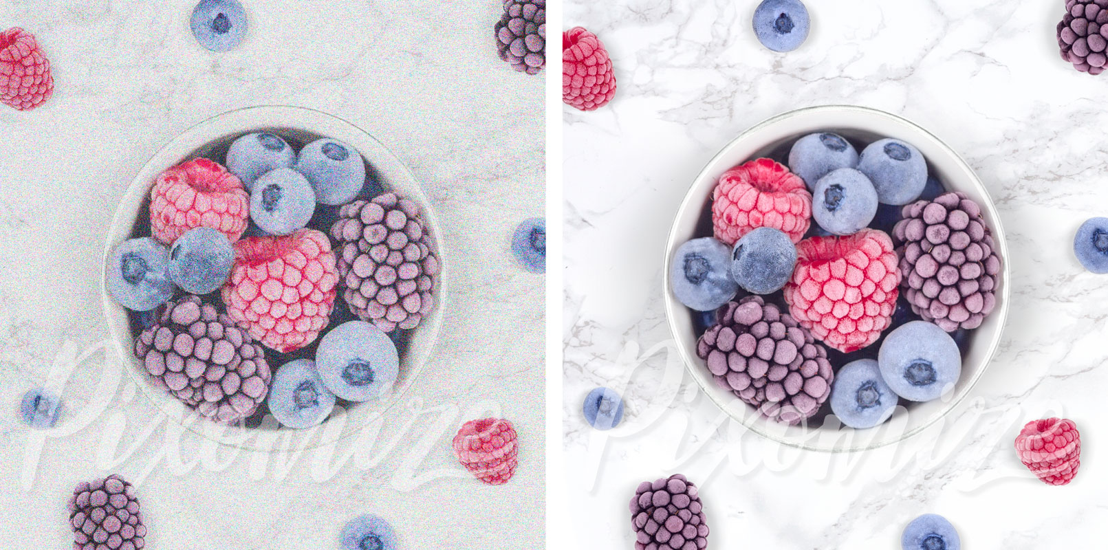
If you are using a DSLR camera to take photographs for your blog, website and social media, then it is best to take these images on manual rather than automatic. This is because you will have much more control over the quality of the photo. You probably know about shutter speed (if the shutter speed is too slow your photographs will be blurry) so I'm going to talk to you about the lesser known ISO setting.
If your photograph is looking too dark, you can up the ISO to let in more light to your camera. However doing so reduces the quality of the image. If you set the ISO too high, your photo will appear grainy - not what you want! Some cameras can produce better images with a high ISO, however it is better to not go over ISO400.
8. Sharp Focus

Image made using Pixomize
There's nothing more annoying than styling an amazing photo, getting all of the lighting and camera settings right, taking your photo, then realising that it is out of focus after you have cleared everything away!
No one wants to share a blurry photo on Instagram, or an out of focus image on their new blog post. The reason having good photographs on your website is so important is because you want to look professional - and nothing looks worse than a blurry photo.
Whether you are using your camera or your phone, double and triple check that your photos are in sharp focus before clearing all of your props away!
Editing
9. Brighten But Don't Over Expose
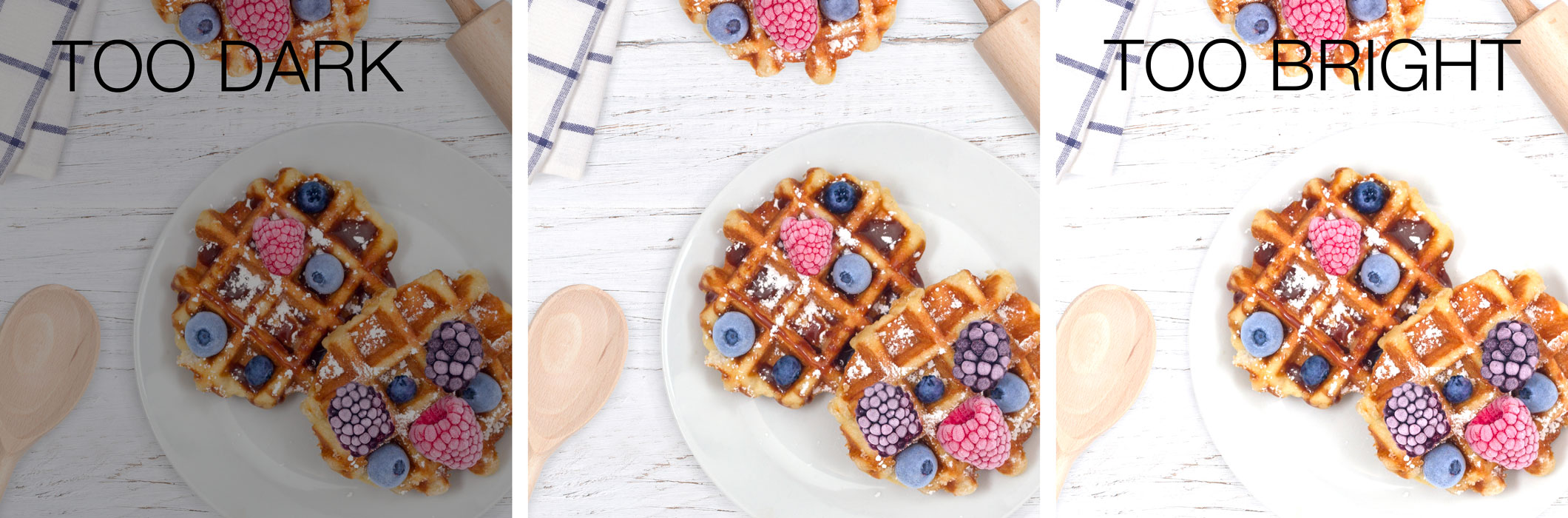
Most of the time when editing a photograph you will need to brighten it a little. Bright photographs always look better on Pinterest, Instagram, websites etc. But it is easy to get carried away and end up over exposing the image. If you brighten the photograph too much you will lose detail, which will appear unprofessional.
You can brighten your photographs in Photoshop, or you can use free editing programs such as pixlr, GIMP, photo pea etc. Using the 'levels' setting is a great way of lightening the darker parts of your photo, without lightening the highlights.
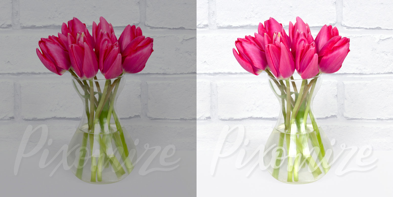
10. Adjust Vibrance

Image made using Pixomize
When editing a photo, most people want to make the colors brighter, and they usually head to the saturation setting to do this. When images are over saturated they look fake - which isn't what you want when you want your business branding to look clean and professional. The vibrance settings often allows you to brighten the colors without them looking over saturated. This setting should be in most photo editing software.
11. Cropping

Image made using Pixomize
Though you may think that it is better to take the photograph exactly how you want it, I actually think it is better to allow more into the frame than you originally want. This is because you can always crop into an image when editing, but you can't get back any part of the photo that was cropped out by the camera. You also have more control when cropping your photo in an editing program.
Also, because of all the different ways you will want to use your photos (Instagram, Pinterest, blog posts, Facebook to name a few) you will probably want to crop your image differently depending on what platform you are using it on.
Did you know that all of the example images I used in this post were made using Pixomize Membership?
That's right! All of these professional photography examples were made using digital props and backgrounds from Pixomize - and you can do this too! That means that instead of styling, taking and editing your photos yourself, you can instantly make your own custom photos that will automatically look super professional. This will save you so much time, allowing you to put more of your valuable time and effort into your business!

Enjoyed examining this, very good stuff, thanks .